Pluribus Intro - Interview with Joey Reinisch
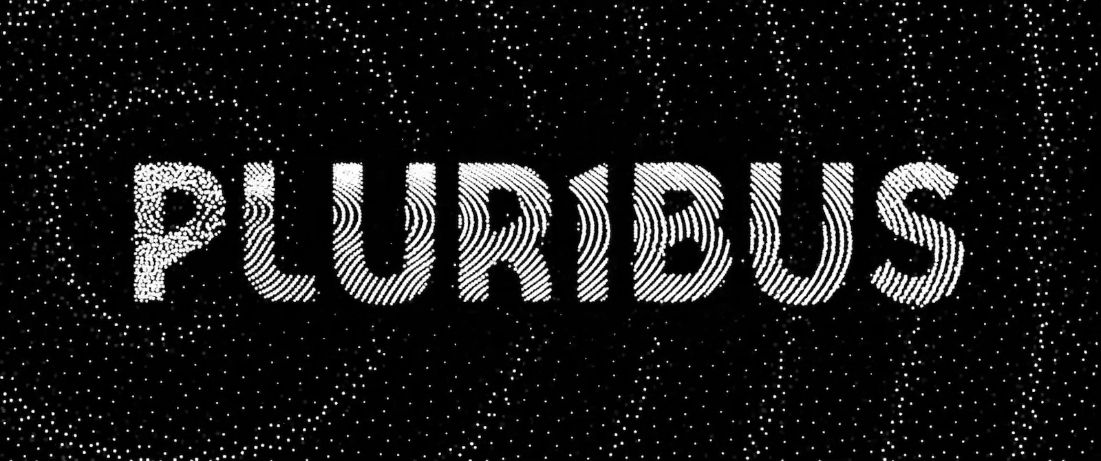
Pluribus is a hit TV show created by Vince Gilligan (Breaking Bad & Better Call Saul fame) that's streaming now on Apple TV. The title design for Pluribus features an elegant particle simulation created using Stipple. We were lucky enough to score an interview with the designer of the titles Joey Reinisch, who is gracious enough to tell us about himself, his work, career and creative process.
Please tell us a little about yourself.
After graduating from Indiana University in 2007, I moved to LA with no real plan or prospects. Later on, I started working in the industry as a PA on the show My Own Worst Enemy through a lucky connection. I've been involved with Post Production ever since, working my way from Coordinator, Post Supervisor to Associate Producer before switching over to Editorial. I worked as an assistant editor for several years, before finally getting my first editing shot on Better Call Saul.
Outside of work, I'm at home with my wife, two sons and two pugs, all of whom I like very much. I play too many video games and watch a lot of terrible movies on purpose. I am also slowly coming to terms with being "middle aged".
Looking at your IMDB credits - you’ve had an impressive career spanning diverse roles ranging from Art Director, Writer, Editor to Visual Effects. How would you describe your professional identity?
The quickest way to describe it is weaponized hyperfixation. I truly enjoy the process of learning new artistic techniques, skills, and software. I tend to gather them with no real plan other than to learn, storing them in the back of my mind "just in case". It is much easier to justify when I tell myself a skill may become useful in my career one of these days, months, or years.
I burn through a lot of hobbies of the moment and still get made fun of for wanting to learn something as niche as bookbinding. Once I figure out the broad strokes of how something works, I’m on to the next thing. When I graduated, I was creating an animated series called Destructo Box with my writing partner at the time, Phil McLaughlin. The show was a great justification for improving our various production skills, and we essentially treated it like a second job.
After picking up steam on Newgrounds, the show eventually became distributed by Mondo Media (Of Happy Tree Friends fame) who we eventually created a second series for called Game Program Attack! (along with it's spinoff War Soldiers.) A lot of my "just in case" skills became useful as we improved and developed these shows as I was responsible for the look, animation pipeline and working with our character animator (Brian Carney) while Phil took the recording/editing tasks. With such a small team, I tried to be someone that could figure out a solution to any sort of creative challenge whether digitally or with traditional art techniques. One could say a jack of all trades but a master of none. My attention span is too short to be a master of anything, but as soon as I have a goal to achieve, I can usually make it happen one way or another.
Tell us a bit about the history of your collaboration with Vince Gilligan. I see that you were also extensively involved in the production & editing of Better Call Saul (one of my personal favorite shows).
I started working on Better Call Saul in Season 4 as Assistant Editor to Chris McCaleb who had worked on it since the beginning. Eventually I would help set the degradation for the Main Title styles in seasons 4,5 and 6. Later on, I went on to edit a Breaking Bad 10th anniversary reel for the reunion panel at comicon which allowed me to get my first one on one experience working with Vince.
After helping Chris with the Better Call Saul Insider podcast, assiting Skip MacDonald on El Camino title design and co-editing the Season 5 episode Bag Man of BCS, I was promoted to edit two episodes of the final season, Wine and Roses and Rock and Hard Place. The crew were very supportive and post-producer Diane Mercer has been a huge advocate of mine even after Saul ended. Her reference played a key role in my hiring for The Pitt.
Let’s talk about Pluribus. How did you get involved with this project?
After having worked on the titles for both El Camino and Better Call Saul, I had a great working relationship with Vince and Diane that stretched past just my editorial job. We got to have many creative conversations and brainstorm with each other. Diane brought me in and trusted that eventually we'd be able to land somewhere they were happy with. I am by no means a "title designer" but I do enjoy the process of figuring things out when there's no true right or wrong answer. You can throw out a wild idea that may or may not work, but it's a space where you can have those conversations and let your mind go weird. Pluribus is such a huge, strange, beautiful thing and when Diane asked, I didn't hesitate.
One of the most striking aspects of the Pluribus title design is how simple it looks yet it’s so effective. It conveys the show’s central themes in just a few seconds. Please explain the creative process behind the design.
We knew from the outset we didn't want the titles to be long. Something you wouldn't need to skip. When we first met to talk about the title, one of the main themes I was chasing was building up an image using smaller pieces. Thinking of all the turned like cells of a bigger organism like the spray paint brush in MS Paint. I also used to have one of these automatic dot pens that would move the pen head up and down on it's own like a tattoo gun which I used to play with a lot. Another one of those things I had and tried for no reason than to try it, but that pointillism idea became something I started to hone in on as a stylistic angle. It seemed to be the quickest way to convey one of the main conceits of the show but could also be a cool visual.
We also wanted to incorporate the signal into the design and having it be a force that spreads this organism through the universe. Helping us see turned and un-turned oranisms switch over as it spreads. After this there was a ton of iteration and experiments. I even tried to zoom into the cells further down to a micro level to show that the dots themselves were alive. As we experimented, ideas and over complications fell off in service of a clean straightforward abstraction that I think really helped solidify the theme and played beautifully against Dave's music.
So at what stage during the creative process did Stipple come into play?
Once we had settled on the visual theme based on mockups, I went back in to experiment with After Effects / Photoshop in how to best convey that style in motion. I was trying lots of things. Filming glitter floating in water, punching holes in backlit black paper, live drawing over a moving timeline, and even messing with some particle simulations in Blender. If I remember correctly, I happened upon one of the Stipple tutorial videos while trying to dig deeper into particle playground. It seemed tailor made for this purpose.
One of the coolest things about using Stipple for this was sort of learning to speak it's language. How to subtly control the chaos by tweaking all of it's attraction variables and particle counts on top of my animation. Since I didn't want it to rigidly adhere to the animation so it felt more flowy and organic, it that meant you had to do a lot of experimentation to see how it handled things with 8000+ dots on screen. Another fun challenge is to hide the initialization of the dots since there are always 8000 even when there's fewer letters visible.
The animation itself is built on transparent greyscale because we wanted the signal ripples to move through the letters and disturb them, but not break them. A mere 1% opacity change on one of the pieces could completely change the way the animation looked. The final piece is a composite of about 6 different sub sequences overlaying a turbulent displacement matte controlling the spread of white through the darker dots while using separate pieces to keep the non-turned dots alive in the background.
All this while rendering at 8K resolution so we are able to push in as close as we do in the opening shot without it degrading the quality.
Do you have any advice for aspiring motion designers, editors, artists?
I really don't consider myself a title designer so take any advice I give with a grain of salt. There are far more talented people out there doing far more amazing things than I am. I'm simply someone that enjoys experimenting with art. Had I found stipple before this project, there is an extremely good chance I would still have ended up buying it and playing with it anyway because it looks so cool, just another thing to add to the toolbox.
If you work in any sort of creative space, new and unexpected challenges will inevitably come up. My goal is to always be able to say "sure I can do that" when these things come up. That simple thing has opened way more doors for me than any degree or credit. Doing so requires constantly learning and going outside of your preferred medium or comfort zone to expand what you are capable of.
If you're someone that tends to only work digitally, try painting with watercolor, or sculpting just for the hell of it. All artistic skills feed back into your process in ways you don't expect. Does that mean I have a garage full of art supplies I use only a couple times a year? Yes. A hard drive full of software I rarely get to use? Absolutely. But being not only able, but willing to throw yourself headfirst into any creative problem, knowing you'll get there in the end, is one of the most valuble things I've learned along the way.
On that excellent note, it's time to conclude our fantastic interview with Joey Reinisch. Thanks a lot for sharing your experience and insight. You can follow him on Instagram.
For more information on Stipple, visit our product page.